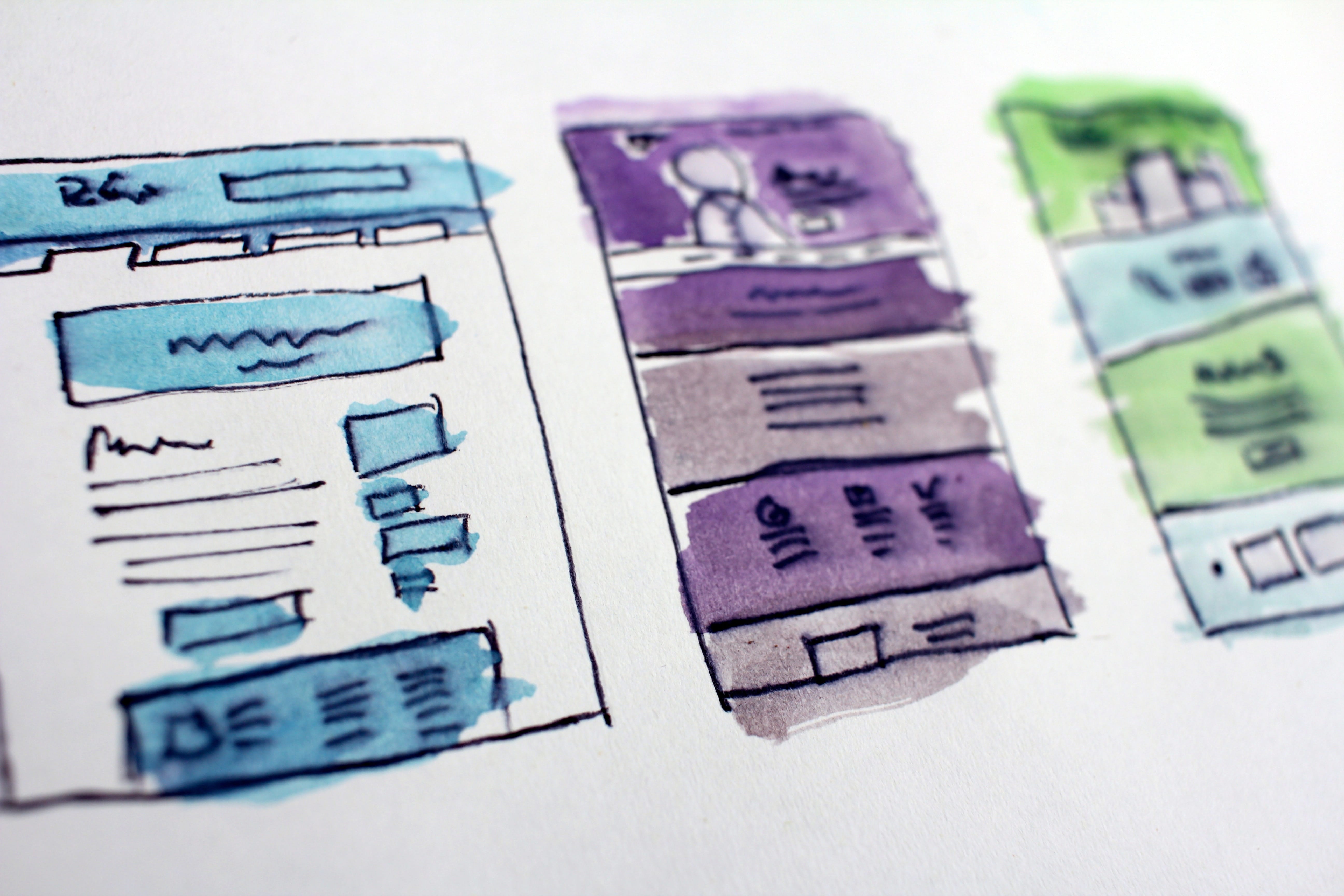
Welcome to part two of our review of must-see law firm websites. In a super-competitive business like law, a good website is a must. Everything matters – from wording to the positioning of background images. If you plan to build or overhaul your law firm website, use our list of seven great examples for ideas and inspiration.
The firm specializes in work issues: equal pay, harassment, parental leave, etc.
Like several other sites on our list, TremainArtaza appeals to emotion above the fold. In three bold words, it tells you not what it does, but how it does it. Note how the content is perfectly readable against the image background.

The list of achievements right below the fold stresses the firm’s credentials.
It’s followed by a simple choice: learn more or contact the firm.

And that’s it. Amazingly, the whole front page has only 100 words of text.
Individual attorneys’ pages feature lists of awards and speaking engagements to create an image of authority.
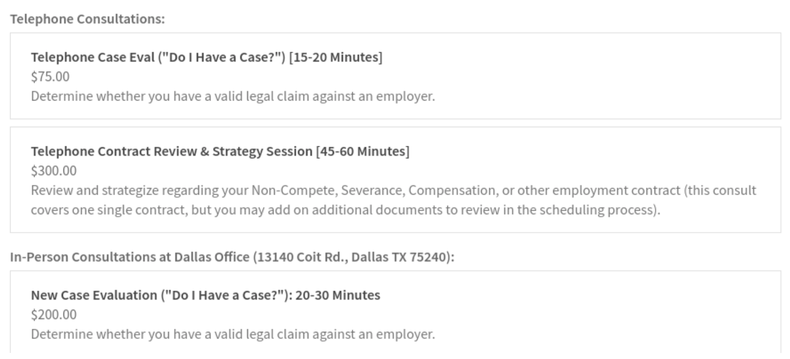
Finally, the initial consultation fees are displayed very clearly:
What can be done better: TremainArtaza lacks a blog – an essential tool for advertising one’s expertise.
Parris’ main practice areas are personal injury and accidents.
Above the fold, a powerful image of the team combines with an even stronger message. ‘Over $1.4 billion won’ – this shows visitors they are dealing with real courtroom warriors.

Across the site, the messaging is about fighting – and winning.
The Team page uses a superbly creative flip box trick. The attorneys look serious – but smile on hover!

It’s a great idea to include case studies of successful settlements, too.
What can be done better: if you have a message you’re proud of, make sure it’s readable against the background. In this case, the image behind is too bright:

We’re seeing some great examples of must-see law firm websites. Come back tomorrow for the last part in this series!
Join the conversation!