In a super-competitive business like law, a good website is a must. Everything matters – from wording to the positioning of background images. If you plan to build or overhaul your law firm website, use our list of seven great examples for ideas and inspiration.
1) YLaw
YLaw specializes in family law, divorce, and asset division.
The site uses creatively chosen images and witty captions above the fold to explain what the firm does. They work much better than a dry description.
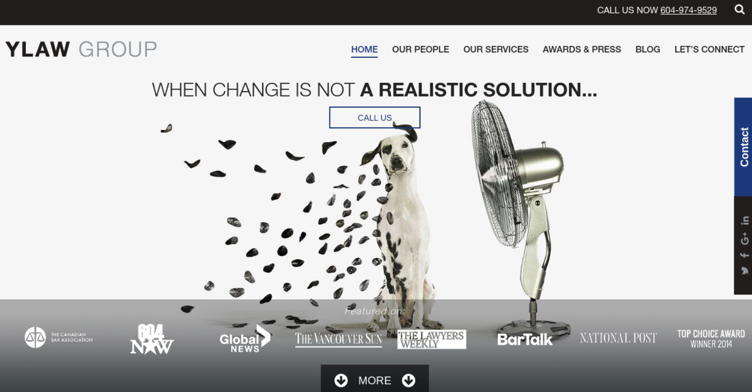
The first screen also features all the high-profile publications that covered YLaw. This instantly creates an air of authority. The More button is itself animated, inviting the user to scroll further.
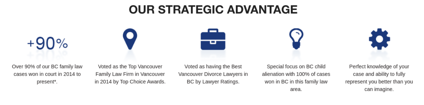
Below the fold, the copy is easy to read and stresses the firm’s achievements:
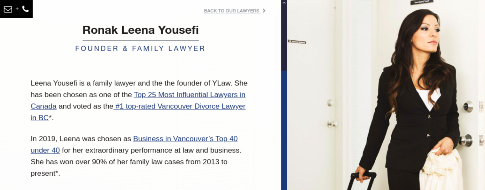
Each of the lawyers gets their own detailed profile page. This allows visitors to establish a connection with the lawyer from the very start – an important thing in sensitive matters like divorce.
What can be done better: photos of the team should be in the same style and on the same background. Instead, they are all different.
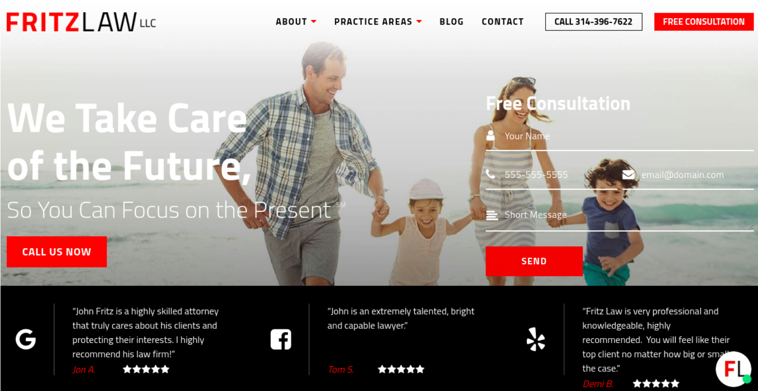
2) FritzLaw
FritzLaw specializes in estate planning – in other words, writing wills, amongst other things.
Placing testimonials above the fold is a great way to create trust from the start. This is because visitors tend to focus their attention on the first screen, skipping most of the content below.
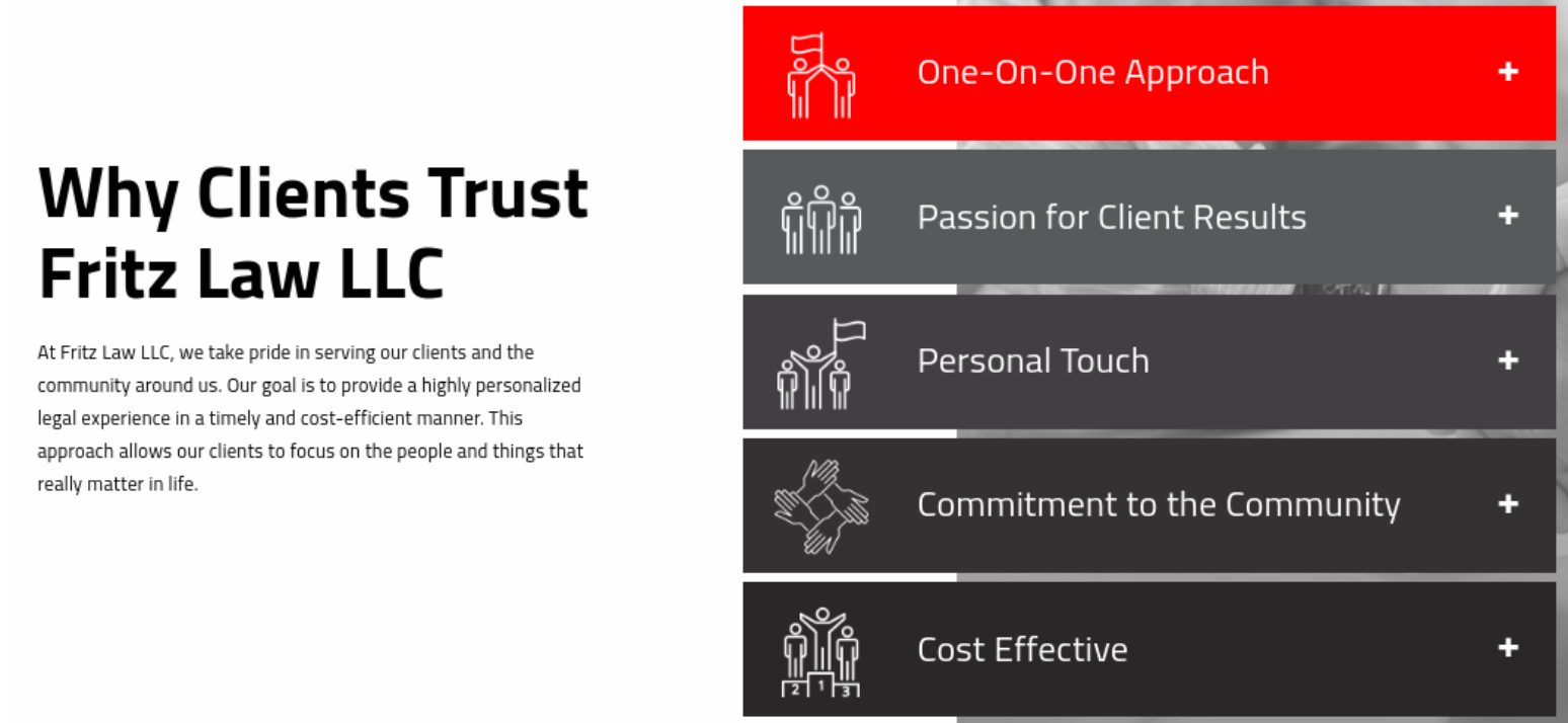
Next, FritzLaw explains who needs their services – in a simple, user-friendly way.
The site makes creative use of accordions and flip boxes to add interactivity. The grey-and-red color scheme is professional and refreshing.
The blog deserves a special mention. It’s frequently updated and features subjects that are actually interesting.
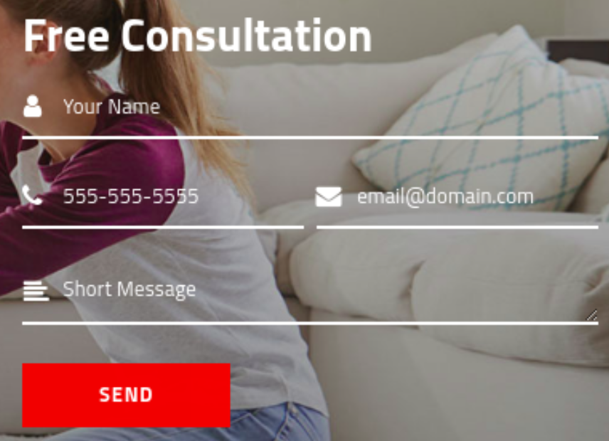
What can be done better: when placing a contact form on top of an image, make sure that it’s readable. Here the background is too bright:
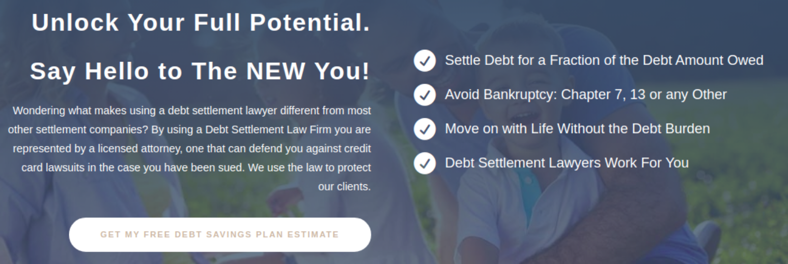
3) McCarthy Law
McCarthy Law is a group of debt collection attorneys who both settle and recover debts.
The site isn’t flashy, but it works very well. The copy appeals to emotions, while the debt calculator form immediately engages the visitor:

Design takes second place here: it’s the words that matter. All the sections use simple diagonal transitions to add dynamism, but that’s about it.
Below the fold, the site continues to focus on the emotional aspects of debt relief. The two main themes are the feeling of freedom and the low cost of the service.
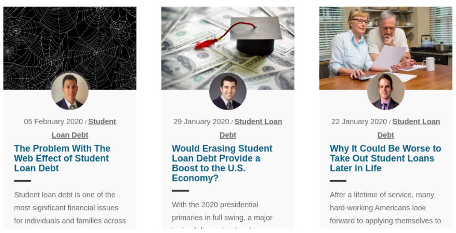
The blog page is packed with useful articles. Each entry is accompanied by a picture of the attorney who wrote it. This promotes the firm’s expert image.
What can be done better: use an actual image of someone on your team above the fold, not a stock image.
Come back tomorrow for a look at two more must-see law firm websites.
Join the conversation!