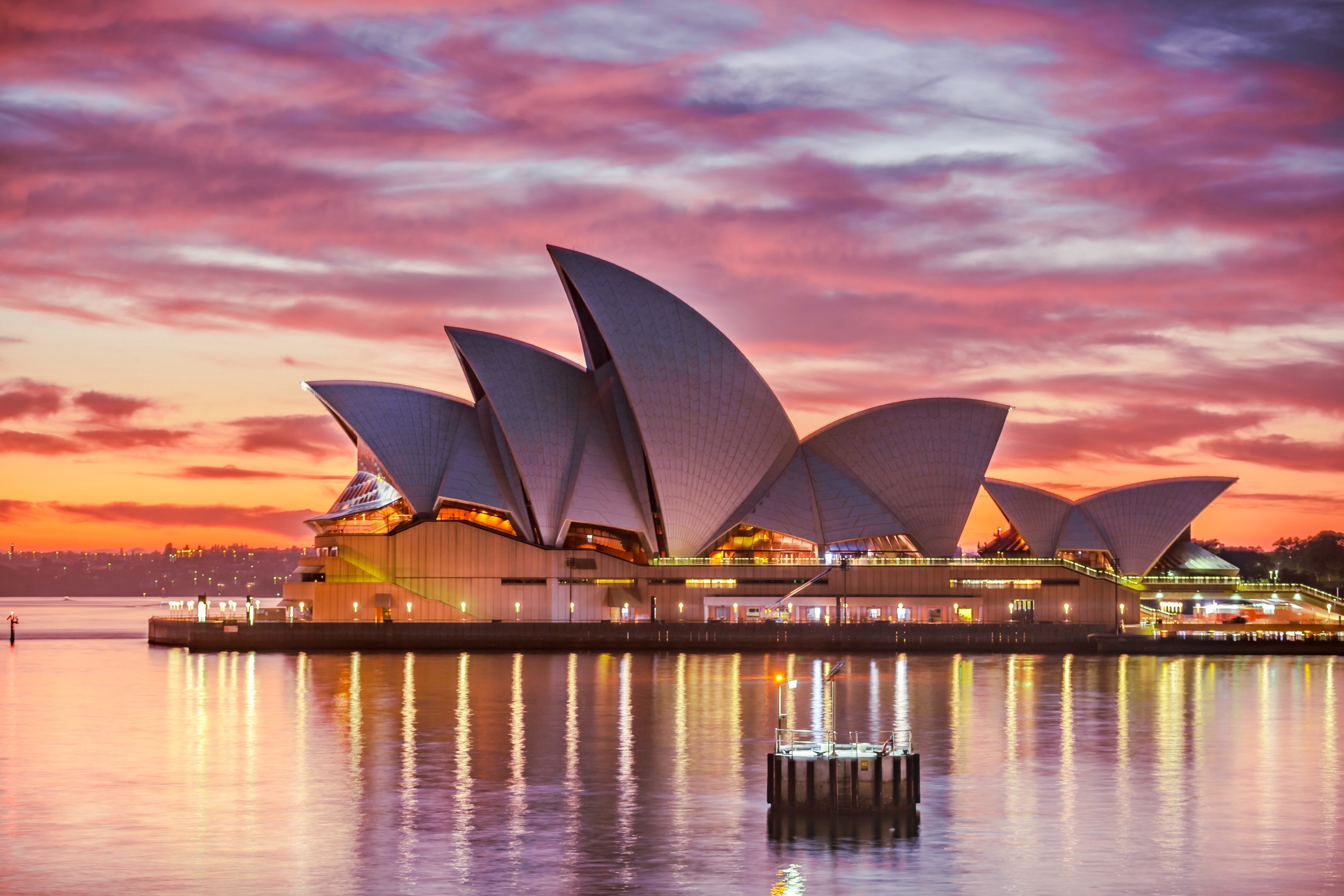
When looking for location photos, focus on realistic editing and muted tones. It would look as if you shot the photos on location, whereas actually, these are stock photos chosen with some thought.
To get the most from Instagram, users must have some idea about graphic design even though they need not be professional designers. It is necessary to incorporate the latest graphic design in Instagram content to increase its attraction and effectiveness. Staying tuned with the design trends helps create campaigns that match with the ever-changing Instagram landscape and give enormous scope for utilizing designers’ creativity. Another reason to focus on the design aspect is to make ordinary visuals look extraordinary such that they garner organic likes speedily. However, to kick start the campaign and create a buzz soon upon uploading it, you must buy Instagram likes that have real people behind them. It is critical to buy likes from real people because it creates genuine engagement, enriches the campaign, and increases conversions.
Besides knowing about the current design trends on Instagram, you must know how to apply them so that you can reap the benefits.
More use of gradients
To understand the latest graphic design trends, you must closely follow the accounts of some leading brands known to be trendsetters on the platform. Some of these iconic brands constantly experiment with the designs to create something unique that later becomes the industry’s benchmark. Analysis of several such Instagram accounts points out that gradients are the in-thing in Instagram design. It consists of a smooth color transition usually used to fill a space or background. The trend is especially noticeable for popular memes and quotes where the background reminds us about the pastel skies of the summer days.
However, to add more variety to the trend, there are likely to be grittier versions of gradients in 2021, which is achievable with photo editing apps containing different filters that help create a layering of smooth color gradient. In addition to grainy layers, we are likely to see color gradients pairing up rough textures and replication of camera style glitches of the vintage years.
Muted color palettes
Muted colors are most easy to implement in the Instagram design. After many years of using vivid colors, designers seem to have grown tired of it and now turning to muted colors. Lessons learned from the past tell us that bold colors might have instant appeal, but it does not help the design stand out. The bold visuals become a kind of run-of-the-mill item that seems typical on the application and part of the crowded space’s cacophony with nothing especially identifiable.
Muted color schemes are easy to create by infusing some white and black of some complementary colors of the vivid colors. To understand vivid colors, imagine some vivid colors that have their edge removed.
Muted colors are more naturally occurring in our surroundings and the reason for many health and lifestyle brands using them in their Instagram design. The best thing about muted colors is that they allow the design elements to draw attraction as the muted colors never become dominant. Instead, it makes the text easy to read.
Are you interested in using muted colors in your existing brand palette? Start by using your brand colors, followed by creating a secondary palette by infusing white or black to the key brand colors.
Use genuine stock images
In tune with the preference for subdued and natural feelings generated by the muted colors, authentic and genuine lifestyle stock photos seem to an obvious choice. The combination is undoubtedly to gain popularity in the coming days. Some stock photos are so realistic that it appears as if you snapped them a few days ago. Instead of people posing for photographs that appear to be entirely artificial, these photos capture real people doing something in the most natural way. The people seen in the images are oblivious to the camera focusing on them as they engage in some activity that comes to them naturally. Besides, the photographs’ natural background does not allow any extreme editing that gives a much more authentic look and feel. It is imperative in the context of the trend of using overly edited photos in social media that look artificial and fake, as you can see in some stock photos used by some brands in their Instagram campaigns.
The trend of using more neutral, muted and genuine stock photos in the Instagram graphic will stay just because of its authenticity that has a considerable emotional appeal to viewers. Using lifestyle photos has become a fad in graphic design, and you can find a vast collection of such images by browsing sites like Creative Market, Deposit Photos, Unsplash, etc. When people are the subject of the photos, look for candid shots with minimal touches and enhancement. When looking for location photos, focus on realistic editing and muted tones. It would look as if you shot the photos on location, whereas actually, these are stock photos chosen with some thought.
Use bold and heavy fonts
Fonts play a critical role in the graphic design of Instagram because it is the secret recipe for increasing visuals’ attraction. When you use some solid contrast in the images, the visual content becomes highly eye catching. Alongside stock photos and muted colors, ensure that you use extra bold and heavy fonts that draw all attention. Most fonts are available in various weights ranging from regular to bold and extending up to extra bold. The lowest row of fonts is extra bold and the heaviest too. The choice of fonts depends on what the designer wants viewers to focus on the most to keep them engaged with the content. If the title is the first thing that designers wish to look at, they would surely use some heavy fonts.
However, the scope of use of bold and heavy fonts is limited only to titles or phrases or messages in your graphics. Use heavy fonts only when vital because its overuse can hamper the graphic’s impact and confuse viewers. So, you need to be careful while selecting the font. It can make or break your campaign.
Join the conversation!